Riley’s Roses
Logo Design / Branding / Print
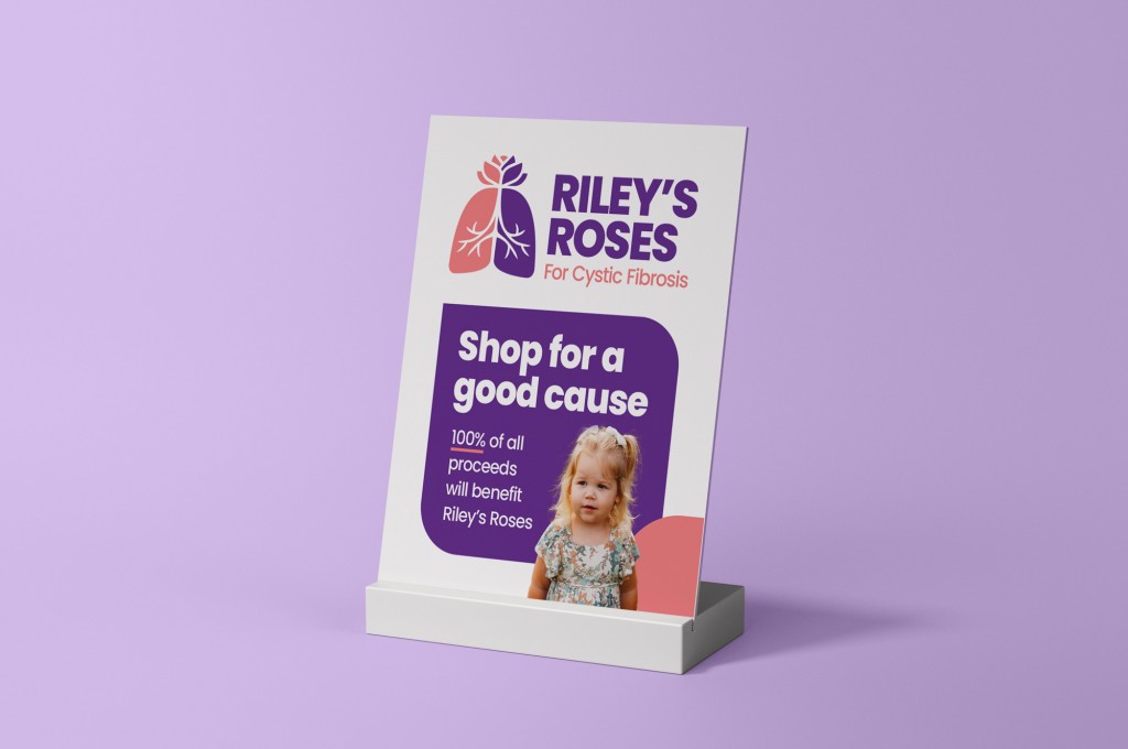
Riley’s Roses is a foundation dedicated to raising awareness for Cystic Fibrosis, a lifelong genetic condition. The initiative is rooted in a deeply personal story—my niece was diagnosed at just two weeks old—making the work especially meaningful.
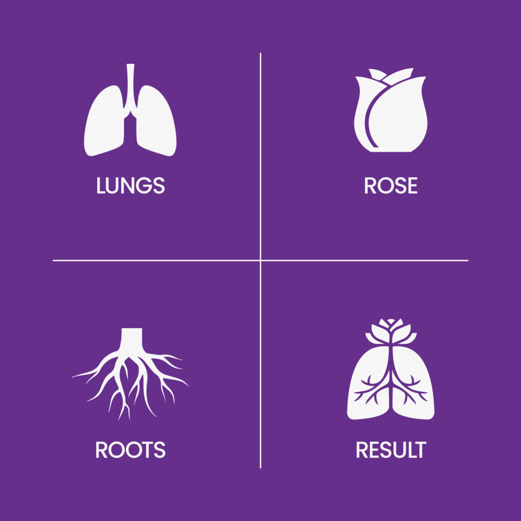
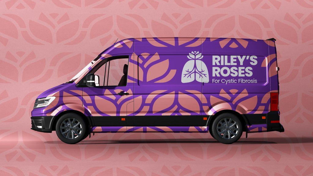
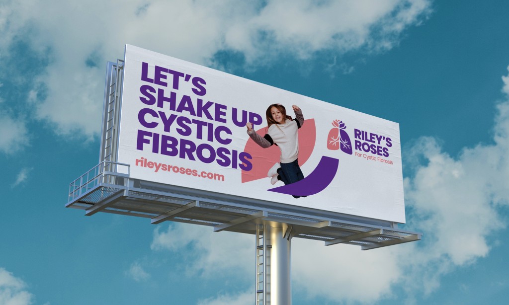
The identity centers on a rose mark that extends beyond the logo, evolving into a repeating pattern and a system of deconstructed graphic elements used across various materials. The mark was also applied to t-shirts sold to support fundraising efforts for the Cystic Fibrosis Foundation, helping turn the brand into a tool for both awareness and impact.